A Dud
The next 4x6 is a dud. I don't like this one much. But I have to remember that it is the process that counts and even when you don't like the finished work there is always something learnt by the doing.
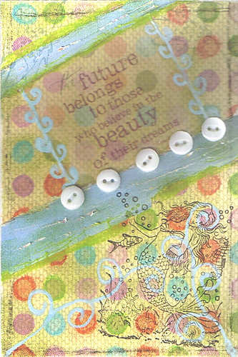
Here is how this one went:
1 PAPER - Paper first. So I decided to try something different with this one and covered the entire base with a polka dot paper background.
2 TEXT - next I put the velum quote on.
3 PASTELS - Good. I love using pastels! I went over all the polka dots with similar coloured pastels to give the background a more artsy look.
4 SAND - yikes! sanding is really going to smudge all the work I just did with pastels. So what I did was sand the text a bit and then I sanded just around the perimetre of the card
5 SMUDGE - Oh no! I guess I'm going to have to smudge the pastels after all. With a dry finger I gently smudged all the pastel polka dots. So far I'm actually liking it.
6 MAGAZINE - Good one. I tore some strips of sky from a mag. page and added above and below the text.
7 INK - Another good one. Grabbed the trusty old distress ink and with a cosmetic wedge I dabbed all over the background and the blue strips. At this point I'm liking the background but those blue strips of mag paper have boxed in the quote and I'm not sure where this is going.
8 CHARCOAL - {sigh} I seem to pick charcoal ever single time I do this. OK, what can I do with the charcoal? I drew a border about a quarter inch from the edges all around the card.
9 DRAW - This seems to be going nowhere fast. Let's give it some ooomf! I got a blue crayola spider writer and drew the spirals on the bottom half and then drew the tiny pattern along the edges of the text. Stand back and take a good look at it and discover I have really boxed myself in here. Oh, well pick the next word and hope for the best. Hopefully, I'll get Image
10 PENCIL - No image. pencil is not my friend here. Hmmm. I shaded over the edges of the blue strips of mag paper.
Well 10 is where I can stop if I want but there is no way this is anywhere near finished.
11 STAMP - Not an image the way I was hoping for but maybe this will work. I stamped the mermaid in the bottom corner with pigment ink and then with weathered wood distress ink I very gently stamped two fish in the upper corners so they just barely show. Looks better now but still hoping for the best.
12 PATTERN - Oh boy. I looked for something that would go with this and couldn't find anything I really liked except these vintage buttons. I must have tried a dozen different arrangements trying to draw the eye away from the boxed text and finally settled on this pattern of 5 buttons.
13 SCRATCH - Curses! Foiled again! I added some lame scratches to the blue strips.
14 CHALK - I chalked over the edges of the blue strips which at least merged them into the background.
Now at this point I was desperate for something good or was going to just leave it as is. So I picked the next word and it was 3D! No way, the buttons were already 3D and I had nothing else that would work with this. So I called it a day and sprayed with fixative to set the chalks, etc.
After this one was finished I quickly started the next one and I can't wait to show it to you tomorrow. I looove it and think it may just be the best one so far!


Comments